yesleads.ca
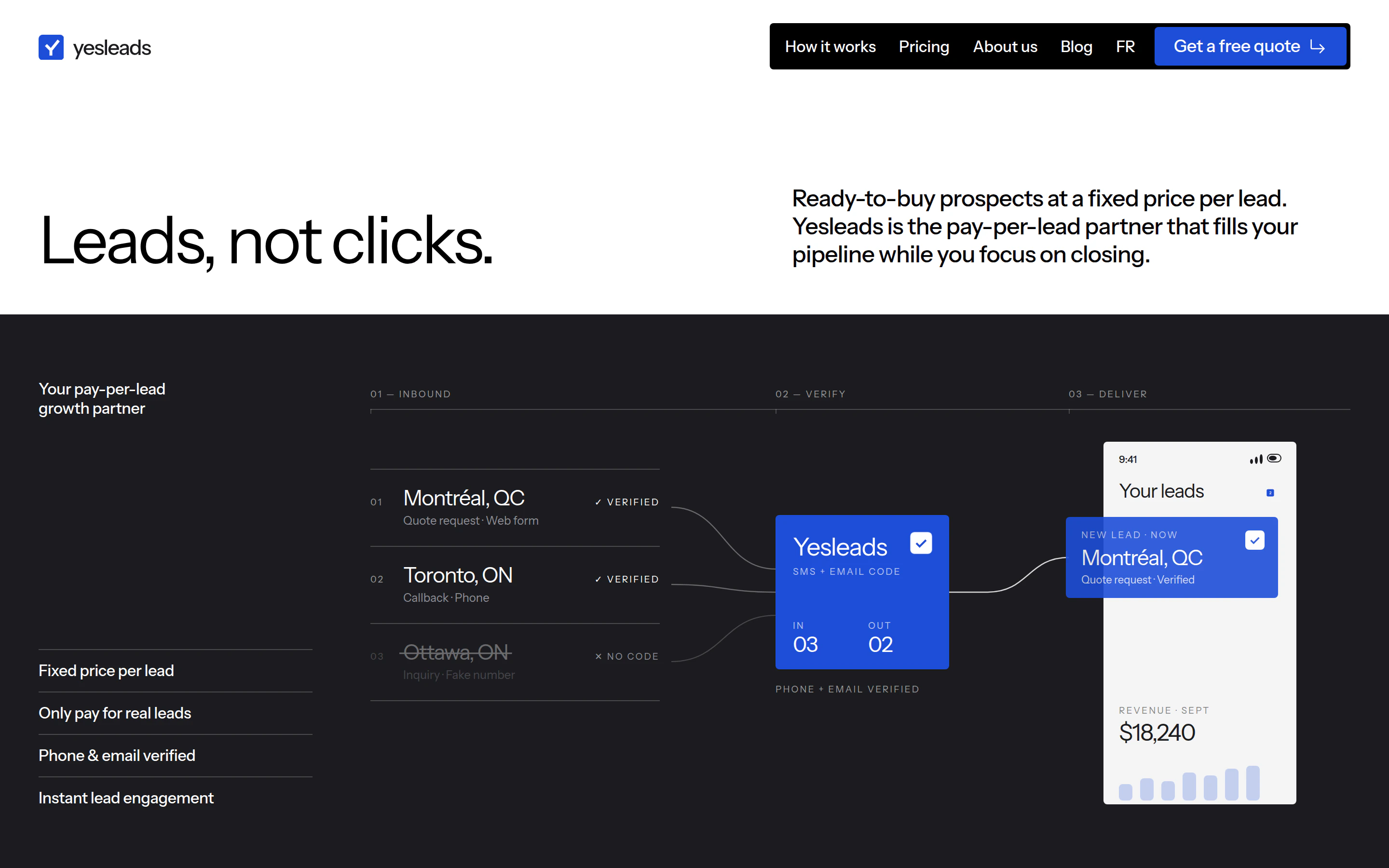
I gave yesleads.ca a strong visual identity and a bilingual website, with animations that show how the service works from the first request to the delivered lead.
The opportunity
The goal was a stronger identity and a modern website that made the offer clear. I wanted visitors to understand what they pay for, how a lead is verified and what happens next, with the same quality of experience in English and French.
What I built
- A distinct visual identity built around a check-mark Y logo, a bold blue palette and Instrument Sans typography.
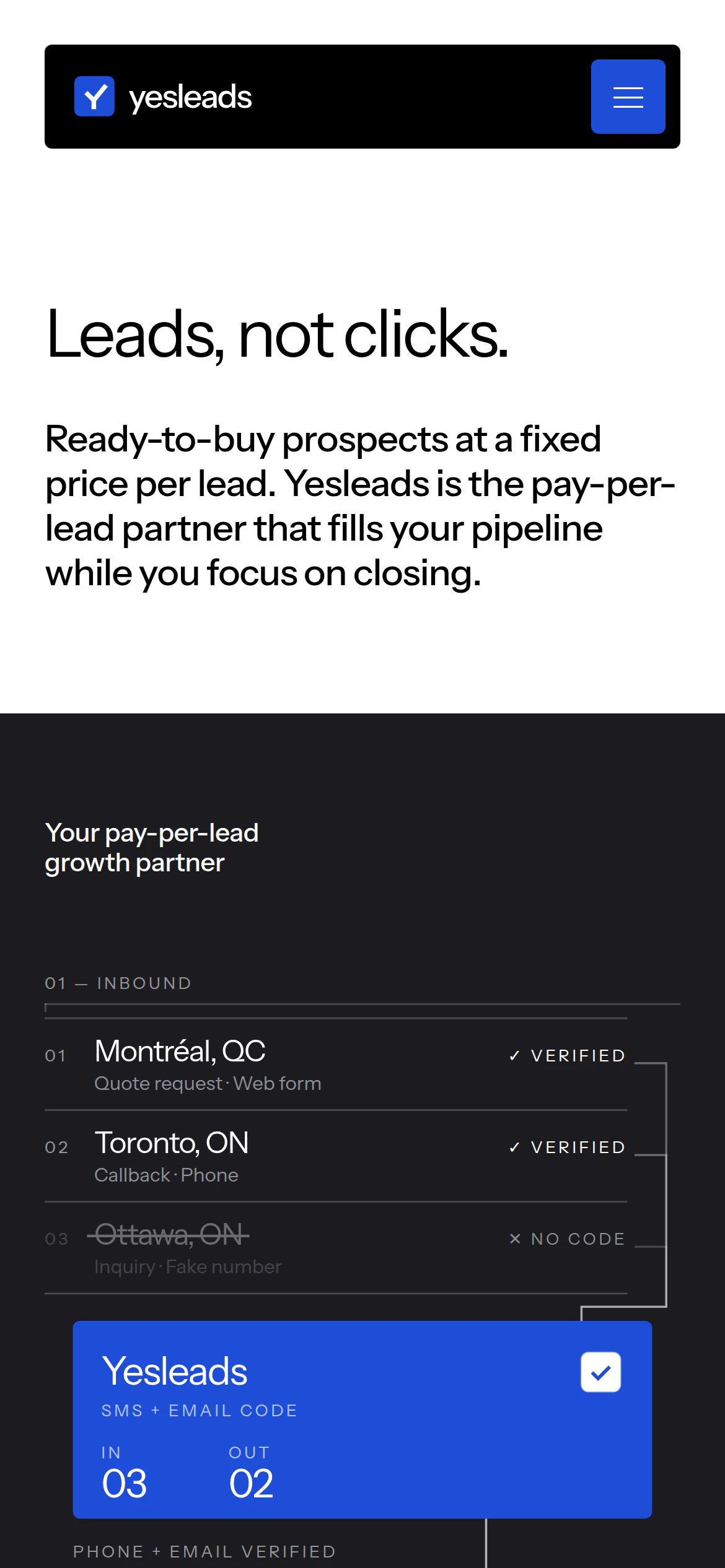
- Animations that explain the service: quote requests move through verification and into a lead list, while the pricing animation shows what customers pay for.
- Service and pricing pages that turn the details of lead generation into a clear explanation of the offer.
- A complete bilingual website with 32 live pages, designed for desktop and mobile.
- A direct path through the service, pricing and common questions to a quote request.
The experience
I started with the identity. The check-mark Y, blue palette and typography give the site a recognisable character, carried through every page from the homepage to the contact form.
The animations do part of the explaining. A visitor can follow a request through phone and email verification, see it arrive in a lead list and understand how the pricing works. The movement gives each step a sequence that copy alone would have to describe.
I organised the pages around the questions a prospective customer needs answered: what do I receive, how does it work and what does it cost? Each answer leads naturally toward requesting a quote, with layouts that stay clear on smaller screens.
I carried the full experience into French, including the navigation and the labels inside the animations. Both languages have complete page sets, dedicated search metadata and links between equivalent pages.